Bar Chart
A bar graph generally showing three different-colored, vertical rectangles at various heights, as compares values across a category. Commonly used to represent various types of data, information, facts, figures, and charts more generally.
Several platforms, including Apple, depict (left to right) a green, red (lowest), and blue bar (highest). Google’s design previously included four bars, with yellow being the highest.
Upcoming events
Latest news
Show more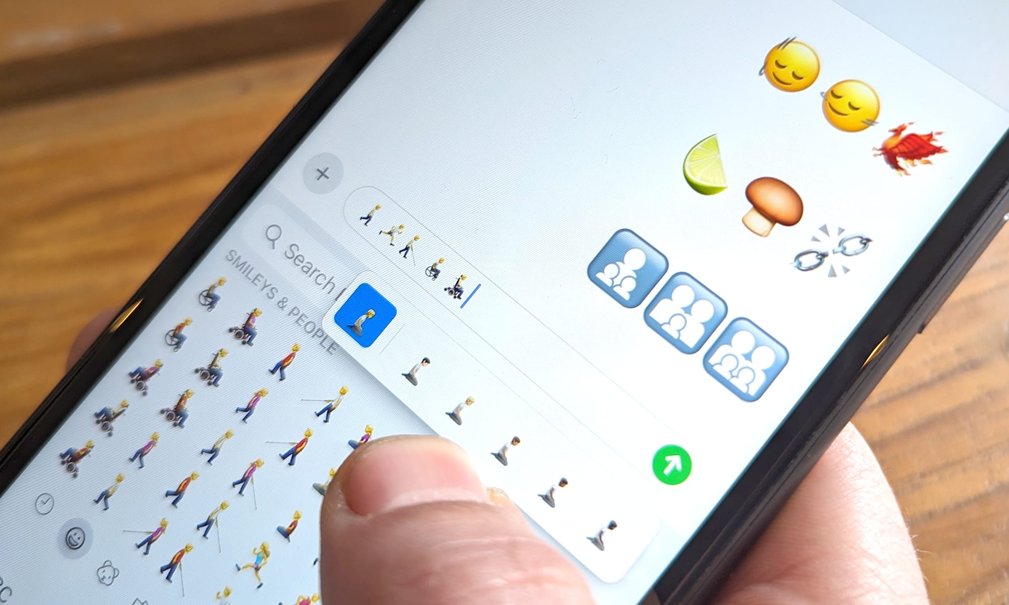
iOS 17.4 Emoji Changelog
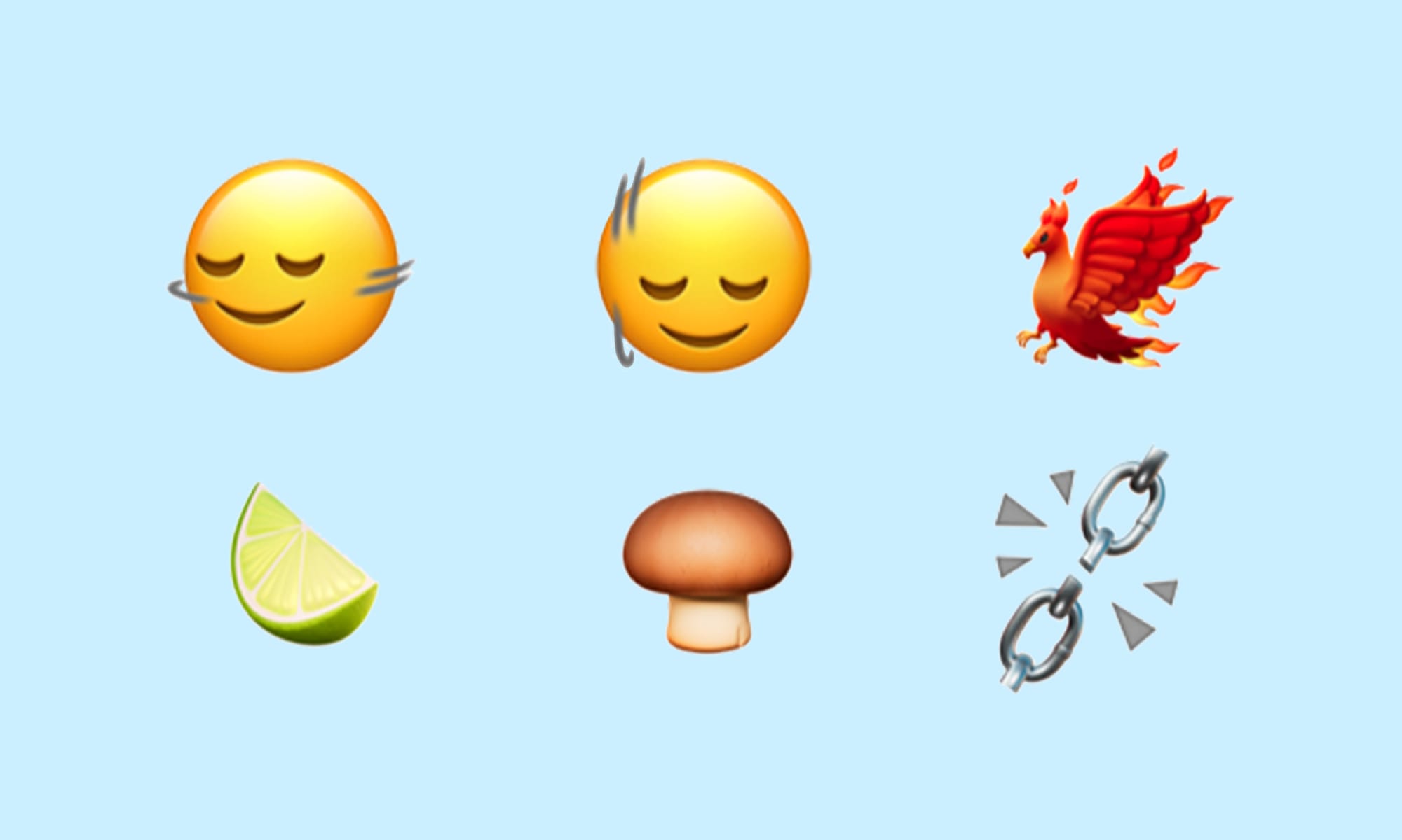
Today Apple has released its latest emoji update, introducing 118 new emojis including a phoenix, a lime, several gender-neutral family designs, and v...
First Look: New Emojis in iOS 17.4
New emojis have arrived on iOS as part of the first iOS 17.4 beta. The new additions include a phoenix, a lime, smileys shaking their heads up and dow...
Google's Emoji 15.1 Support In Noto Color Emoji
Today Google has officially unveiled its full-color designs for Unicode's latest approved emojis, which include a phoenix, a lime, smileys shaking the...